A look into improving logos aesthetics
Goals of the Design
My newest project is a logo for the rock band, The Converters. They are a Rock band with a biker and punk aesthetic. I need to match that aesthetic with the icon I create, while keeping the text legible and brandable enough to be used for merch and other areas of expanding the band.
First logo Draft for the Rock Band
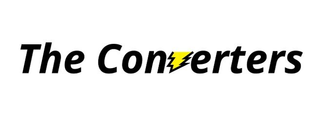
These are the first two concept mockups that I made, that are in two completely different directions, one is more soft and friendly with a little bit of a mechanical vibe, due to a converter being a mechanical device that redirects electricity. The other is less friendly, it has a much more purely electrical vibe to it. A V made of lightning striking down and hitting the ground underneath it.


Feedback on the Design
After showing off the ideas to other graphic designers, I was met with lots of useful feedback. Most of it was suggestions of directions to go in, expanding on what potential they saw in these two designs. From the advice that was in the same direction I wanted to go, I took away that I needed to make the designs much edgier, and have a unique symbol to go with the logo.
The top logo would need a new typeface, as well as a smashed ground effect underneath the text to act as an almost underline, from the force and power of the lightning strike.
The bottom style would need to be given a less friendly typography as well as some more edits to make the type stand out.
The New Direction
A big favorite amongst reviews was the special V in both designs. Since the V sound sticks out in the word converter, it was an easy choice for stylization. I would like to have the V be changed to a stylized logo, that can be shown independently as the band’s symbol. This would solve the issue of a lack of an independent symbol, and keep the logo simple and easy to understand, with the edgy font redesign I will go with.
Plans for the Future
For the next iteration of the logo, I will be combining elements I liked from both previous logos, into one that has much more of a bite to it. Something edgy that still holds true to my less is more style. This new direction is stylish and simple, while still screaming punk and edge in appearance.


